Contents
- About the Block Editor
- Text and Media Blocks
- Inline Tools
- Layout Blocks
- Publishing or Updating a Post
1. About The Block Editor
When you first open a page, post, or other content type that uses the Block Editor, you’ll see a screen like this:
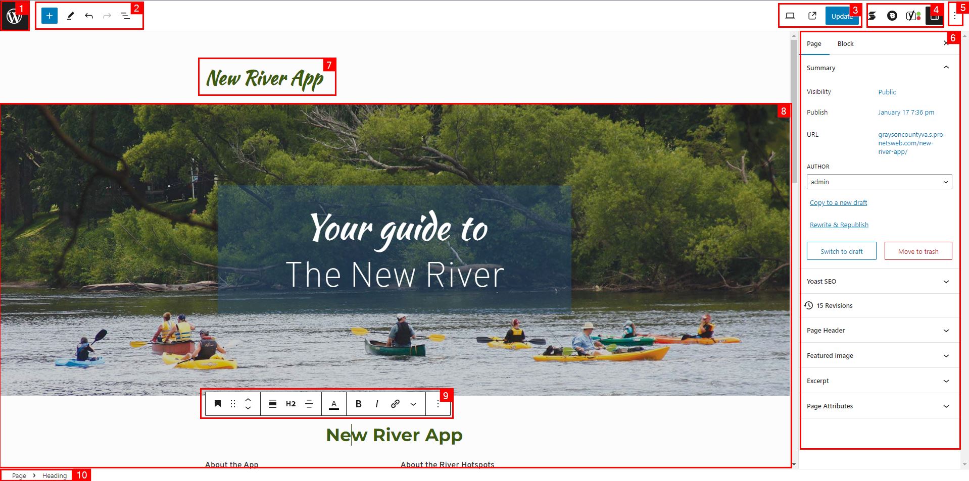
The exact look of this page will differ, but below is a guide to the different parts of the page as highlighted and numbered:
- Clicking this takes you out of the editor, to the admin area.
- Editor tools, from left to right: Add New Block, Tool Select, Undo, Redo, and Outline View
- Publishing & preview tools from left to right: Preview, View Page, and Publish/Update Post
- Editor Settings: This will vary depending on what plugins you have, the far right item is the page settings panel and block settings panel.
- More settings: Less commonly used or extra settings for the editor and page.
- Page & Block Settings Panel: You’ll spend a lot of time here in the editor, as you control the page settings and block behavior / design settings here.
- Page title: The title of the post, show in various places in the backend and frontend.
- Page content: This is the block editor itself, where most of what you see on the page will live.
- Block toolbar: This provides access to quick tools relating to the block you’re editing.
- Editor breadcrumbs: This tells you what block you’re editing and where it falls in the editor outline.
With the block editor, everything on your page is a block. Blocks are used for everything from content like text, images, links, and more to layouts that can be used to build complex page designs.
The block editor is approachable in that you can start by just doing basic word processing, copying text in from Word and adding images & links inline on the page.
“Type / to Choose a Block”
Whenever you start working on a new page or post, or if you’re adding a new section you’ll encounter a blank section titled “Type / To Choose A Block”
This is a shortcut you can use to access your most commonly used blocks, and you can also type to search for blocks.
Note that if you don’t want to add a block, and just want to enter text, all you have to do is type.
Add Block Panel
If you’d like to see all of the blocks available for your site, you can click the “Add Block” button in the top-left of the editor. It looks like this:
Block Settings
Every block has advanced settings you can control by opening the block settings pane, this is under the Block tab in the section labelled “6” in our screenshot above
Some of the common settings are:
- Color: Used to set colors for the text, background, and other elements of a block
- Typography: Used to set the size of text, weight (boldness), and other settings.
- Dimensions: Used to add space around the block.1This setting usually contains options like “Padding” and “Margin” – padding refers to the space around the content of a block, e.g. the text in a “Paragraph” block, while the margin refers to the space around the block as a whole.
Blocks can also have additional settings that can be found by clicking the “+” icon on a settings item or the icon.
Post Settings
Every page & post has settings that you can change and apply to the post as a whole. These appear in the Post, Page, Event, Business, or Product tab in the section labelled “6” in our screenshot above.
- Summary
- Visibility: Allows you to make a post private, password protected, or public.
- Publish: Allows you to schedule a post to publish in the future.
- URL: Clicking this lets you set the “slug” – which is the final part of the post URL. (Learn more)
- Yoast SEO – Provides an at-a-glance overview of your post’s readability and SEO analysis. (Learn more)
- Revisions – If enabled for the post you’re working on, this lets you view, compare, and restore past versions of this post.
- Categories, Tags, and Other Taxonomies – These allow you to organize your post by assigning it to a category on your site, these groups are used to create pages that list these groups together.2A great example of categories is an online bookstore, there are categories like “Non-Fiction,” “Fiction,” “History,” “Sci-Fi,” “Romance,” etc.
- Featured Image – An image that is associated with the post, these are show in special places on the frontend and sometimes the post itself.
- Excerpt – A summary of what your post or page is about, often shown in special places on the frontend.3A common place where the excerpt is used is for blog pages, where each post on the page shows only the excerpt to tell readers about the post before they click.
2. Text and Media Blocks
When building a page, the first place you’ll probably start are with text & media blocks. These allow you to structure the content on your page, add images, setup hero sections, and more.
You can find all of your block options under the Text and Media sections of the Add Block Panel.
Paragraph, Heading, and Image Blocks
These blocks are the bread-and-butter for building pages. Effective pages are organized by topic using headings. Headings are numbered in a hierarchy, starting with H1 and going down to H6. Like a table of contents in a book. 4You can view an outline of your headings by clicking the three vertical bars icon in section “2” as highlighted in the screenshot at the start of this article. Then click the Outline tab, it looks like this.
There should only be one H1 on a page, all others should be H2 or below. If your page has a title already, then you already have an H1, if you’ve disabled the title, you should add an H1 as high on the page as possible.
Paragraph blocks are the default whenever you type in a new space in the editor without adding a block. You can highlight sections of them to make them bold, italics, or add links in the text. See the “inline tools” section below for more about that.
Image blocks allow you to add pictures from your Media Library or by uploading a new picture.
Gallery Block
The gallery block allows you to setup an image gallery on your page that shows one or more images in a grid.
List Block
The list block lets you create a bullet point or numbered list of items.
Cover Block
The cover block is another bread-and-butter type of block as it allows you to put an image behind text and other blocks. Letting you create impressive hero sections like the one titled “Your guide to the New River” in the screenshot above.
3. Inline Tools
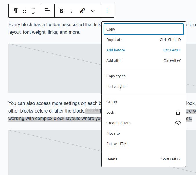
Every block has a toolbar associated that lets you control inline or special aspects of the block such as the layout, font weight, links, and more. This appears in a floating toolbar when you click the block in the editor.

You can also access more settings on each block, by clicking the on the end, with useful tools for duplicating the block, or adding other blocks before or after the block.5The “Add After” and “Add Before” options are very useful for working with complex block layouts where you want to control exactly where a block goes.
Tip: Moving the block toolbar from floating to the top toolbar. 6You can go to the more settings menu in the top-right of the screen, see item 5 in the screenshot, then click View -> Top Toolbar to move the block toolbar to always appear on the top toolbar, like this.
Adding FontAwesome Icons
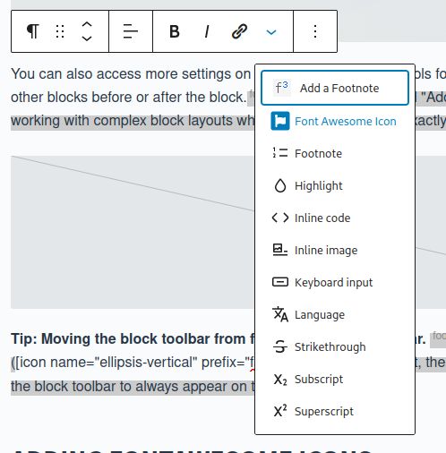
Your site includes access to a library of icons from the FontAwesome icon library. You can access to this by going to the block toolbar’s inline Add FontAwesome Icon option. Access this via the icon on the toolbar.
4. Layout Blocks
Layout blocks are used to create more complex layouts containing text & media blocks.
Columns:
Create a section with a fixed number of columns, for example here’s a 3 column section with the columns highlighted:
Column 1
Column 2
Column 3
Row:
Create a section with an unlimited number of columns that can wrap around automatically based on how much space is available.
Item 1
Item 2
Item 3
Item 4
Item 5
Item 6
Item 7
Item 8
Item 9
Item 10
Item 11
Item 12
Item 13
Item 14
Item 15
Item 16
Stack:
Create a section with an unlimited number of rows that can automatically distribute / align items vertically.
Group:
Can be used to group together headings, paragraphs, images and other blocks to make it easier to move them and manage them as a group.
Alignment and Justification
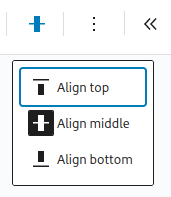
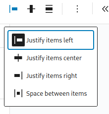
Columns, rows, stacks, and groups all have their own alignment and justification options. These can be used to control how the items line up on a page.
Full Width And Alignment Of Blocks
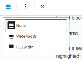
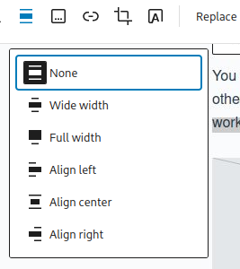
Many blocks can be set to be full width to make them stretch to the very edges of your website. Images & text also can sometimes have alignment options to position them left, center, or right in their block. Similar to the alignment options in Word.
5. Publishing Or Updating a Post
In the top right of the screen you’ll see a button labelled Publish or Update, click that to make your changes live. You can also schedule a page to be published or work on a draft copy of a post.
Adding A Link To The Post
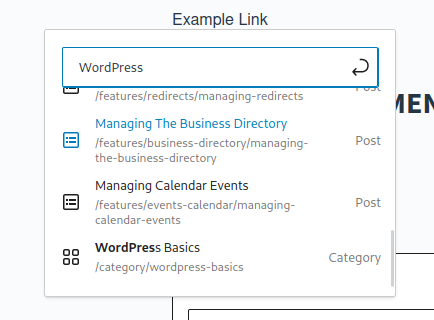
On the block toolbar you’ll see an option to add a link, with this option you can search for pages, media, or paste in URL from your web browser. You can highlight text or select images to make them a link.
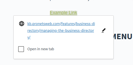
Once you’ve made a link you can click on it to change the settings, for example to make it open in a new tab, or edit the link.
You can use this to add links on your new post, or link to the new post from elsewhere on the site.


Adding To The Menu
Once you’ve published a page you can go to Appearance -> Menus in the backend to add it to your navigation menu.
More Resources
- Managing Your Website Navigation Menus
- Copying Block Layouts and Page Layouts
- Saving Block Layouts and Synced Patterns
- Restoring Page Revisions
- Scheduling A Page To Publish Or A Change To A Page
- Working On A Draft Copy Of A Post or Page
- SEO Tools & Settings
Footnotes
- 1This setting usually contains options like “Padding” and “Margin” – padding refers to the space around the content of a block, e.g. the text in a “Paragraph” block, while the margin refers to the space around the block as a whole.
- 2A great example of categories is an online bookstore, there are categories like “Non-Fiction,” “Fiction,” “History,” “Sci-Fi,” “Romance,” etc.
- 3A common place where the excerpt is used is for blog pages, where each post on the page shows only the excerpt to tell readers about the post before they click.
- 4You can view an outline of your headings by clicking the three vertical bars icon in section “2” as highlighted in the screenshot at the start of this article. Then click the Outline tab, it looks like this.
- 5The “Add After” and “Add Before” options are very useful for working with complex block layouts where you want to control exactly where a block goes.
- 6You can go to the more settings menu in the top-right of the screen, see item 5 in the screenshot, then click View -> Top Toolbar to move the block toolbar to always appear on the top toolbar, like this.